From March 31st, 2014 to December 29th, 2017, I’ve made 963 commits on my personal website, brianch.uk. That means that there’s technically 963 versions of the site—but most of these commits are small tweaks that added up to slightly different versions through the two years this site has been around.
These tiny, minute changes constitute three full redesigns. Rebuilding my personal website was a way for me to cultivate good HTML/CSS practices and actually remember how to center a div. There was always something to learn and improve on. I always felt that my website could have been more accessible and polished.
Finally, within the last few months, I decided to learn UI design, change up the whole interface, put some thought into my goals for it, and officially have a version 3.0.0 (though it’s probably somewhere closer to version 3.1.23 by now). I’m still trying to improve on it, but currently I’m mostly satisfied with how it turned out. Moving forward, I plan to add small features and design fixes through small commits.
I thought you might like to see the redesigns the site went through. I’ll also walk through my process for designing version 3.0 after. If you’re interested in learning UI design, think of this post as a crash course in it.
Version 1.0 – March, 2014

At the time, I had to consult Stack Overflow constantly because I didn’t know HTML or CSS. Most of the codebase is the result of me looking at the source code of websites I liked, and then stripping out parts I didn’t need.
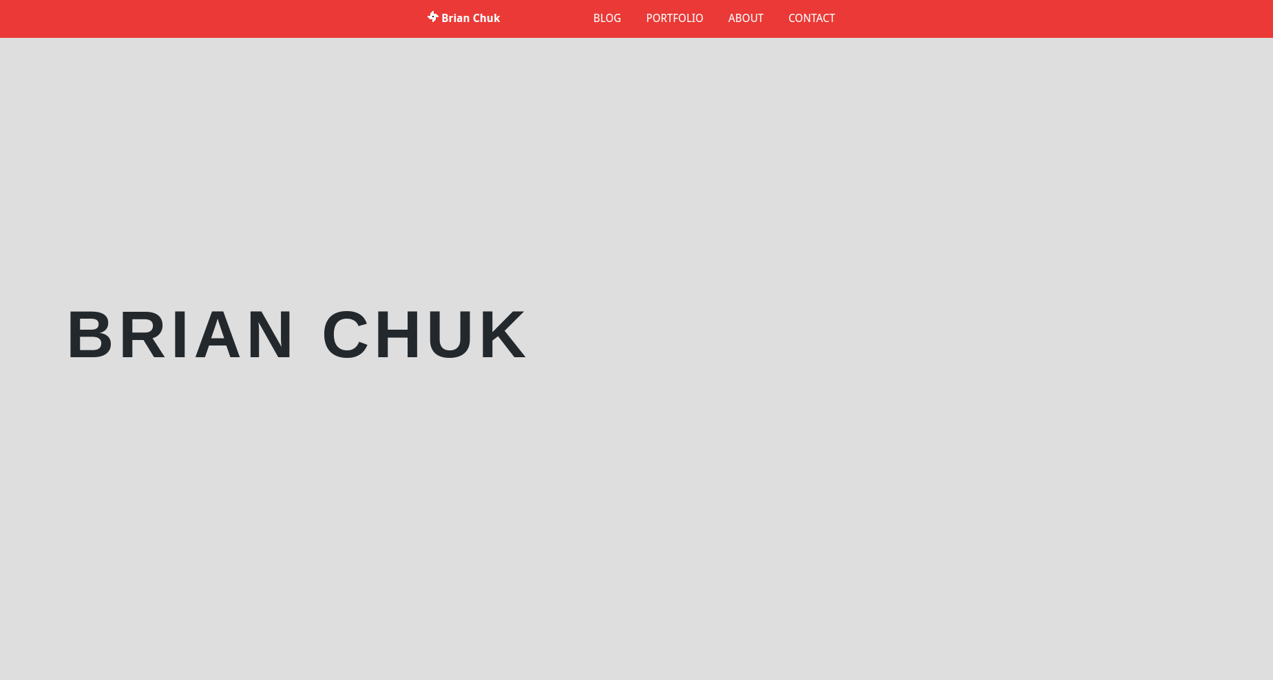
As you can see, I didn’t put much thought into the design. I used the typeface Droid Sans because it was free. I used the color red because it’s my favorite color. The favicon I made is supposed to be a pinwheel—I have no idea what my reasoning was for that.
Since I didn’t know what media queries were, the site was not responsive at all. If you opened it up on a phone, it would redirect you to an about.me page.
You can check out the site here and the code here.
Version 2.0 – April, 2015

This time, I used the typefaces Lato, Big John, and Keep Calm. The favicon is a solid color that changes respective to the theme of the web page.
You can check out the site here and the code here.
Designing Version 3.0 – December, 2017
 Here we are. Designing and coding this website turned out to be more challenging than it seems, but mostly because I was designing for myself. I went through many design iterations because I wanted to create my best version possible.
Here are some goals I wrote down:
- Website should look more professional and timeless. I don’t plan to have another major redesign for around a decade hopefully
- Quality content is king. Focus on having good writing/imagery and display it in a neat, clean, minimalist manner
- Website should look unique. I wanted it to have a style that’s distinctly mine. It shouldn’t have been seen before in another software engineer’s site
- Website should feel personal. I loved it when I saw my friends browse through my old projects and read my stories. The website should encourage a browsing/digging behavior
- Website should be easy to manage (for me to add more content)
There was one question I had to answer before I started designing.
What is my brand?
That is the most important question when starting a new UI project. A brand is the values and connotations of a product that not all companies would share. So a brand cannot be “good” or the “best” because all competitors want that too. But a brand can be modern—or it can be traditional. You see, those adjectives are diametrically opposed. You can’t have it both ways.
Of course, there will be words that exist on a sliding scale and neither of them will be on the money for you. For example, I want my website to be between friendly and professional. But there are some adjectives that nail it perfectly.
In this case, I wanted my brand adjectives to be:
- Technology-focused
- Professional
- Simple
- Modern
- Elegant
- Minimalist
- Sleek
Once I knew what brand I wanted to convey, all of my design choices were focused on enforcing that brand. I’ll talk about general design decisions first and then dive deeper into design choices for each page.
Alignment & Spacing
Generally, a good rule of thumb in UI Design is to align absolutely everything. Proper alignment will make things look more visually pleasing and will also make it easier for users to scan over a page. There are exceptions to this format.
For instance, on large screens I used three different page width CSS classes. Listed in descending sizes, they are : wide-content-wrapper, thin-content-wrapper, and article-content-wrapper. All elements nested inside a div of one of those classes will be aligned. This blog post currently uses article-content-wrapper, while the about page uses the wide-content-wrapper. With this setup, I can alternate between different widths in the same page to indicate that some content is different.
Having multiple widths is also useful in controlling how I want to display information. Larger, attention-grabbing text works well with wide-content-wrapper to take up more of the screen. Longform content such as this blog post is easier to read when placed inside a thinner width.
Designers recommend using between two or three alphabets per line. Meaning, line widths should be between 52 to 78 characters. To further increase readability in paragraphs, a line-spacing of 1.2x to 1.5x the font size should be used.
Color
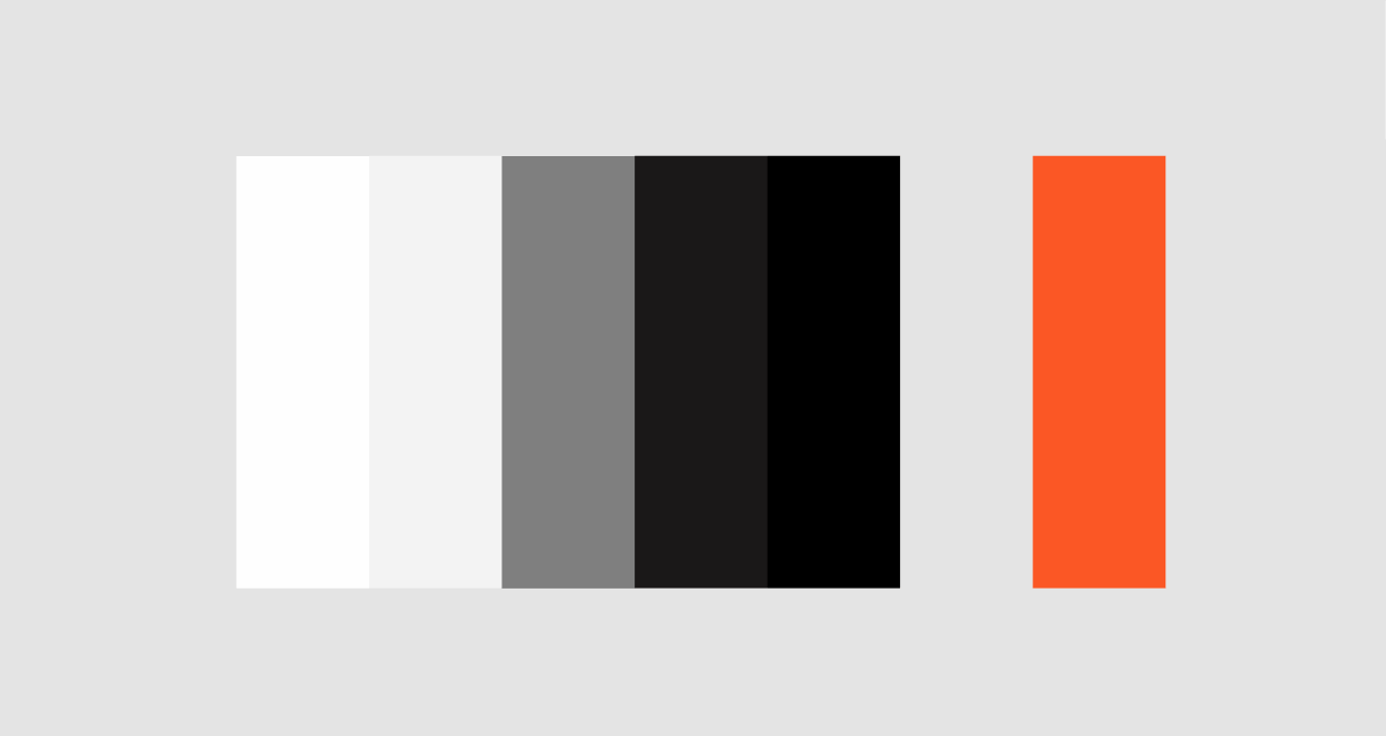
// Grays
$white: #FFF;
$lightGray: #F4F4F4;
$gray: #808080;
$darkGray: #1B1919;
$black: #000;

// Colors
$red: #FC5824;
To focus more on content, I wanted to understate the user interface. I used a palette of grays so my writing & photos could attract your attention more. It’s elegant. It’s minimal. It’s classy. It’s also much more professional than the messy rainbow of pigments in my previous version.
Using several shades of gray also enables me to control how much contrast I want between elements. If I want to lower the importance of something or smooth out a transition between sections, I can use grays that are close together. If I want to indicate, “HEY, we’re onto something different now,” I can use a jarring contrast of grays. The NOTEBOOK blog elements are associated with a light gray background, while portfolio-related elements are associated with a dark gray background.
If I wanted to demand attention with color, I started with a red. However, the red did not contrast well in dark grays and the color tends to have a negative connotation, so I lightened it to a reddish-orange.
Typography
The website uses three typefaces. Technically, there’s a fourth one, Hack, for code snippets. I like using it in my terminal and code editors because of its high legibility.
Typefaces can be divided into two main categries: serif and sans serif. Serifs contain the small features at the end of the strokes within letters. Typefaces without serifs are referred to as sans serif.
Circular
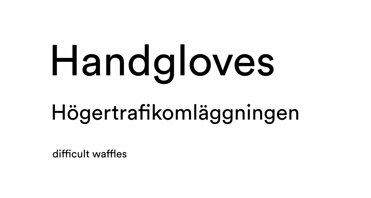
My favorite typeface. Circular is a geometric sans-serif typeface. It’s regular, current, timeless, and neutral. Despite its modernity and geometry, it stays warm, friendly, and approachable. It’s also very versatile in use; Circular is suitable for large and small text sizes. For these reasons, the typeface is used everywhere in big tech companies, from Google to airbnb to Spotify.
I use Circular everywhere in titles, longform text, and labels.
Lyon Text
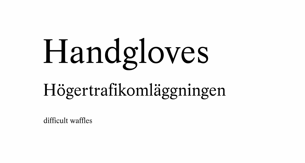
Lyon is a serif typeface for modern publications. Its design is loosely based on historical models of the historical models of 16th century punch cutter Robert Granjon, while still retaining a contemporary look. The typeface made its debut in the New York Times Magazine. It’s elegant.
I also use the sister font Lyon Display in blockquotes (example).
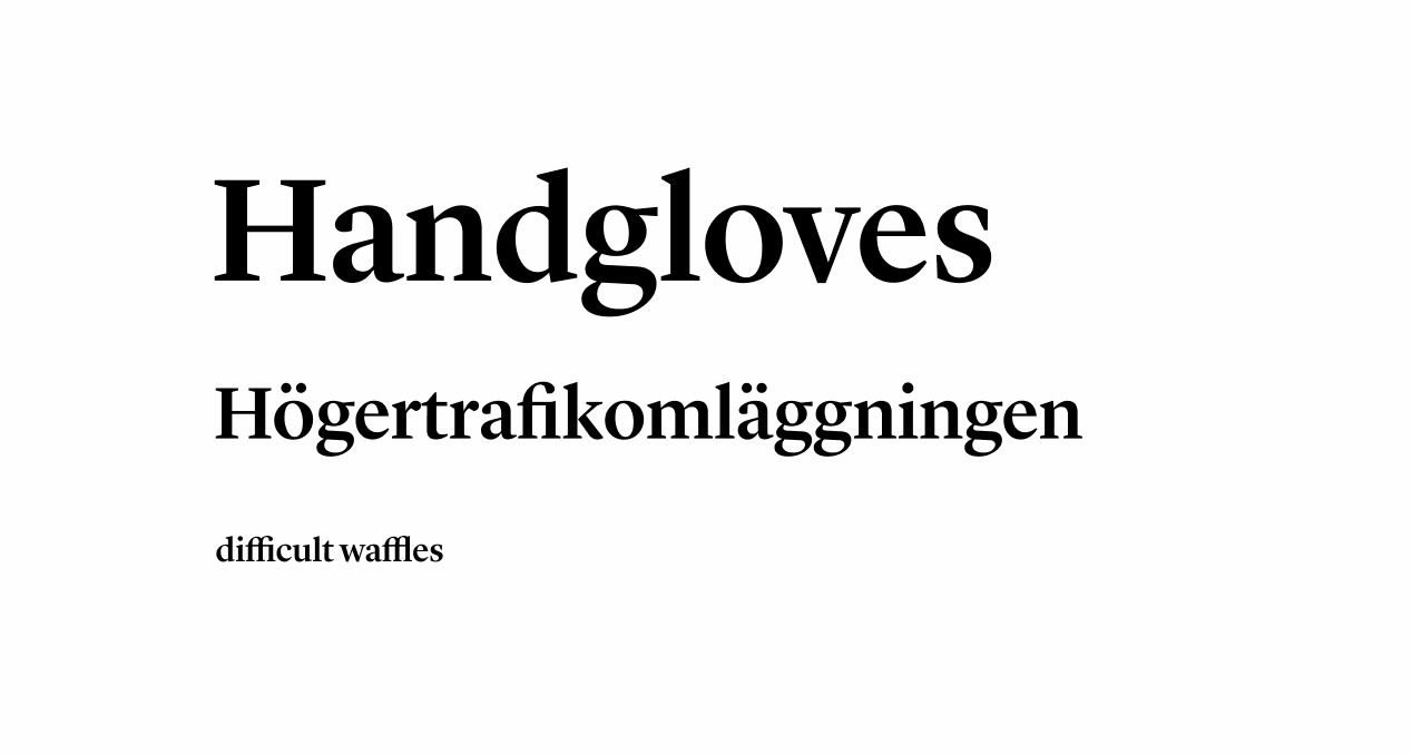
Note that when a type has “text” in its name, it is designed for long blocks of copy. Type with “display” in their name are primarily intended for larger sizes.
Pairing fonts
I chose Lyon because it also pairs well with Circular. To find fonts that aesthetically match each other, set the fonts as transparent, color them differently, and then overlay them on top of each other.
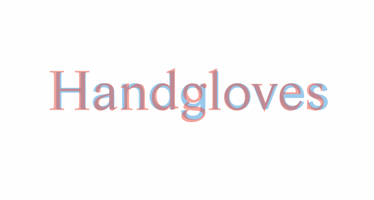
In the picture above, Lyon Text is displayed in red while Circular is displayed in blue. Notice how corresponding characters have matching strokes and have the same amounts of empty space within them. If the letterforms cover each other well, then the typefaces will pair well.
Blender
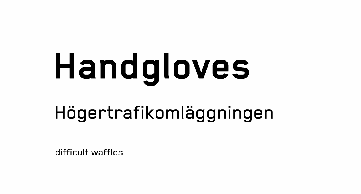
Another geometric sans-serif typeface. But in contrast to Circular, it’s extremely angular. I chose Blender because of how noticeably different it is from the other two typefaces. It also feels technical and data-driven, which fits the focus of this website. Which is why it’s used by Palantir.
It’s useful for displaying text that is distinct from the rest of the content. I use Blender for three purposes in the site: calls to action, labels, and dates.
Page Design & Implementation
I used the same approach when designing each page. I started with writing down all of the content of each page, and then arranged the content. One style rule I tried to follow was to avoid containers and cards. I wanted to focus more on the content and have text stand by itself.
You can see how I make more screen room for the content with the header’s design. It’s a navigation bar of floating links and a transparent gradient, to minimize attention.
The website is programmed in HTML (608 lines), SCSS (1911 lines), and Javascript (1312 lines). I use Jekyll to generate my static website. Guard-livereload was really handy while I programmed and wrote. It automatically refreshes my web pages when I save an update, so I don’t have to. Since I don’t use a Mac, I used Figma to prototype my UI. The icons are sourced from Entypo and the mobile hamburger is from John Suh. I use tinypng to compress my images.
You can look at the site code here.
And that takes us to today
So what do you think of the new layout, design, and structure? Is it fast and easy to navigate? What do you wish would be added or taken away?
I still have a few additions to implement. Off the top of my head they are:
- Fix the vertical rhythm. Vertical spaces between elements on a page should be consistent with each other. I feel that at some points my spacing in this website is a bit awkward
- Launch the newsletter. I haven’t kicked off the email list because there’s such a few amount of blog posts. Who would want to sign up for something that doesn’t have any samples?
- Expand the width of code snippets from article width to the full window. Sometimes the code does not fit in the boxes
- Figure out what my voice is. This is more about improving the substance of these blog posts and making them feel more natural
- Add a contact page? I’m still considering whether I actually need this. If I do, Formspree is a great project that supports static HTML pages
- Look into home page animation code issues. Not all computers (such as old netbooks) are capable of running it, so it’d be helpful to automatically cancel the animation if it’s too laggy
In retrospect, I probably could have just updated the styles of old personal website instead of completely rewriting everything from scratch. It would have been much faster to simply change the color scheme, typefaces, and fix up the spacing.
But Version 3.0 felt like the right thing to do. I don’t regret it. In the past couple years, I felt that I had built too many unfinished side projects that were never shipped. I rarely worked on personal projects that have been used by others. I learned a lot from trying new technlogies, but I wasn’t stepping out of my comfort zone. I never experienced what it was like to build for real users or figured out how to generate revenue.
This website serves as a marker of time, for something I could point to and say, Here was a before and after.
I’m spending more of my time on actually finishing interesting projects. Can’t wait to share them :)
P.S. This site’s favicon is a reference to a Japanese comedy superhero, One Punch Man.
If you’re interested in learning more about good typography and UI design, I recommend:
- A Five Minutes Guide to Better Typography
- If you have the time, Butterick’s Practical Typography is an incredible resource
- Erik Kennedy writes a ton of articles on UI/UX design and runs a UI/UX course as well